In the past decade there has been a flurry of new and upgraded railway stations constructed across Melbourne, designed by a variety of local and international architecture firms. Here is my best effort at compiling a list of the architects behind Melbourne’s railway stations – any additions or corrections would be much appreciated.

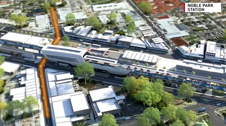
Carnegie, Murrumbeena, Hughesdale, Clayton and Noble Park
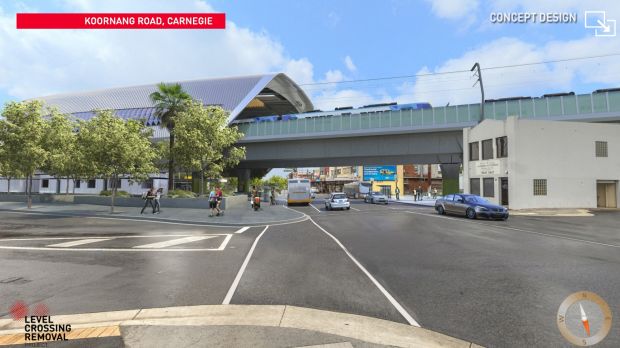
Level Crossing Removal Authority artist’s impression

Level Crossing Removal Authority artist’s impression
Level Crossing Removal Authority artist’s impression

Level Crossing Removal Authority artist’s impression
Level Crossing Removal Authority artist’s impression
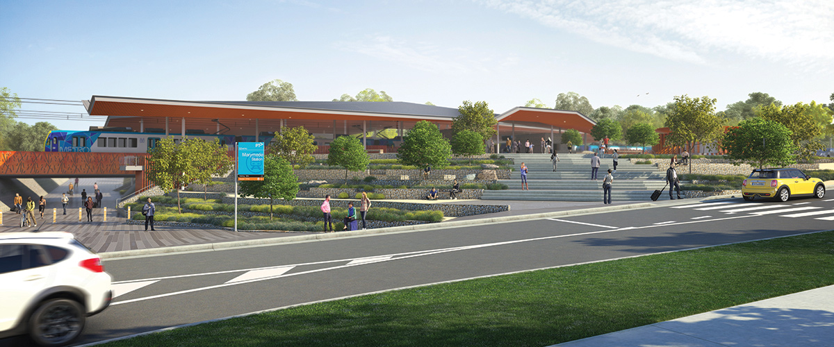
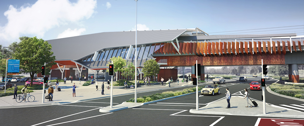
Mernda Marymede and Hawkstowe
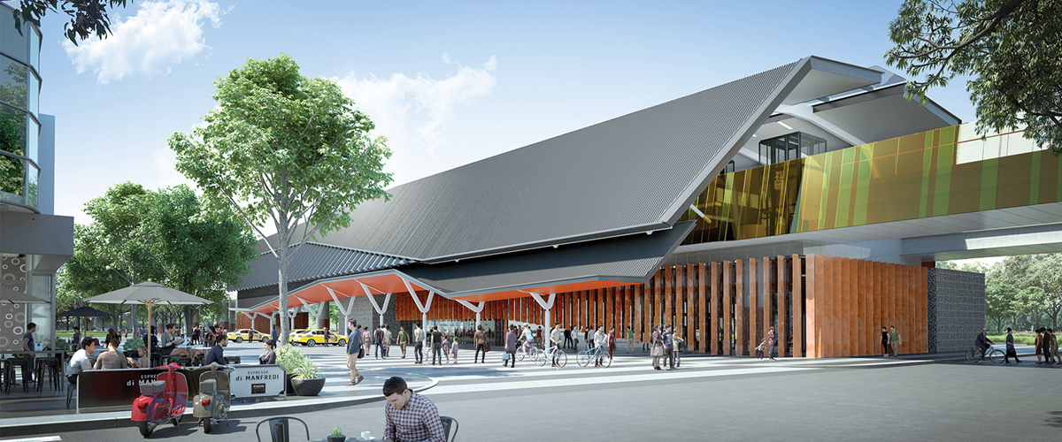
Level Crossing Removal Authority artist’s impression
Level Crossing Removal Authority artist’s impression
Level Crossing Removal Authority artist’s impression
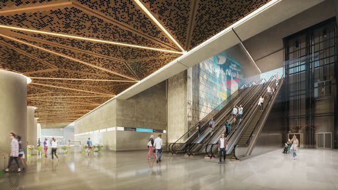
Arden, Parkville, CBD North, CBD South, Domain

Melbourne Metro Rail Authority artist’s impression

Melbourne Metro Rail Authority artist’s impression
Melbourne Metro Rail Authority artist’s impression

Melbourne Metro Rail Authority artist’s impression

Melbourne Metro Rail Authority artist’s impression
Southland, 2017
Public Transport Victoria artist’s impression
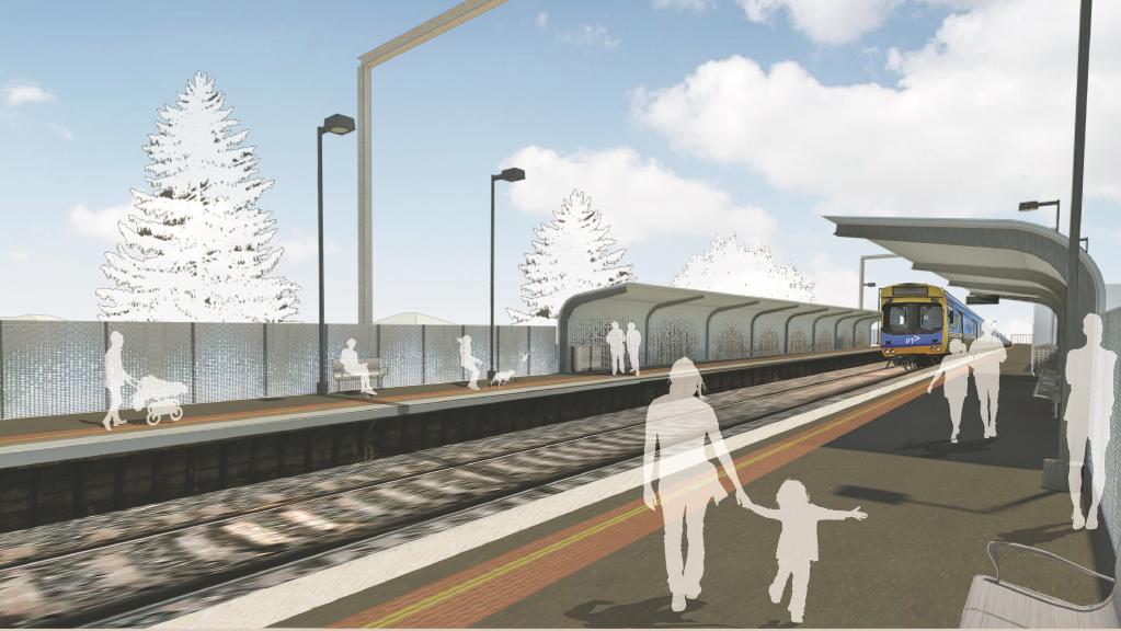
Heatherdale, 2017

Level Crossing Removal Authority artist’s impression
Caroline Springs, 2017
HBO+EMTB (phase 1+2), Jackson Architecture (stage 3, including duplication)

Bayswater, 2016

Level Crossing Removal Authority artist’s impression
St Albans, 2016

Level Crossing Removal Authority artist’s impression
Ginifer, 2016

Level Crossing Removal Authority artist’s impression
Ormond, 2016

Level Crossing Removal Authority artist’s impression
McKinnon, 2016

Level Crossing Removal Authority artist’s impression
Bentleigh, 2016

Level Crossing Removal Authority artist’s impression
Gardiner, 2016

Ringwood, 2016

Wyndham Vale, 2015

Tarneit, 2015

Balaclava, 2014

Waurn Ponds, 2014

Mitcham, 2014

Springvale, 2014

Williams Landing, 2013

Footscray, West Footscray and Sunshine, 2013

Sunbury, 2012

Diggers Rest, 2012

Cardinia Road, 2012

Lynbrook, 2012

South Morang, 2012

Epping, 2011

Thomastown, 2011

Laverton, 2010
Unknown

Coolaroo, 2010

Westall, 2010

Nunawading, 2010

North Melbourne, 2009

Heatherdale, 2007

Kananook, 2007

Southern Cross Station, 2007

Roxburgh Park, 2007

Craigieburn, 2007


“Caroline Springs, 2017
Unknown”
exactly
I’ve since been tipped off as to the architects behind it. 😛
Thanks Marcus, thats great to know finally !
Interesting that theyre done by a range of architects, but are all similar in a way, a predominance of dark painted metal. Seems to be two main types – the flat roofed rectangular style, and those with folded roofs, angular struts. And perhaps a third type, being ground level stations, that are essentially just a couple of shallow V canopies, with some enclosed area. Bayswater perhaps the standout for having more angles than straight walls. (excluding southern Cross and the Melb Metro).
A lot seem to be very low key / low profile – wonder why ? Youd think a railways station should be a prominent public building, at least with a big sign (not just the blue thing on a pole). but then the old ones were rather low key too.
Dark and angular – sounds like lots of modern institutional architecture. A quick Google image search for ‘Building the Education Revolution’ shows plenty of similar styled school buildings.
https://www.google.com.au/search?q=building+education+revolution&tbm=isch
Anyone noticed how appalling Nunawading is today? That bus shelter is a terrible design, stinks of urine, the fans inside make a loud noise, the door constantly opens and closes due to poor layout with the seats. The whole station is scratched up with graffiti. Who could possibly say this was a good design? I bet the rest of these underground stations will end up looking the same.
Stinking of piss and scratched up with graffiti seems to be a standard feature of any Melbourne railway station, no matter how long ago it was built.
Have you been to this station much? It’s nasty. There is no place on this earth where this was a good station. The design is terrible. The entry from the East side of the platform isn’t actually an entry to the station itself, it merely takes you underneath the road. Great, what’s the point? Isn’t the point of this station to sit under the road? It fails to do this.
I have no problem with modern designs, unless they literally throw out common sense, and we all know for a fact that they’ve done this in designing these stations. They are gigantic concrete and steel monstrosities. Dude, we don’t care for fancy artistic stations, just give us a station which works.
PS Footscray is an awesome station, that’s how you build a modern station.
I’m not a fan of Footscray – changing trains often requires touching off then on again, and for the City Loop you need to exit the station and walk down the street!
https://wongm.com/2014/11/inconvenient-interchange-footscray-for-city-loop/
Yeah, platform 1 is pretty dumb, so is not having V/Line platforms at North Melbourne, even though the tracks literally pass next to it.
Hey you missed Diggers rest and Sunbury station when they were rebuilt as part of electrification to Sunbury in 2012.
Cheers – I’ve added them, Grimshaw appear to be behind the stations.
Hi, love your posts/blogs so informative and it just adds to much of my dismay….yes it’s all building up but much of it is regressive rather than progressive …our transport is so OLD archaic and demonstrably out of touch with 21C.
As for building designs ….maybe a woman should be instructed to design more often than not these buildings lack simplicity and engagement …same all same old
Cheers
An important question to ask is what do architects consider success – a building that wins awards, or something that the client and end user are satisfied with:
https://blogs.crikey.com.au/theurbanist/2016/05/12/awards-tell-us-architecture/
The Cox link for Roxburgh Park Station: “Accessibility to all facilities was paramount in the design.”
Struth!! I’m still waiting for good accessibility to the station, it was made considerably worse with the apartment development next door to it.
Roxburgh park station is a really weird station. It’s like they were tapping into old public housing projects from the 80’s when they designed it. They were like, hey let’s make this station look like someone had tried to build an apartment complex, but then went bust midway, and now all we have is this shocking concrete minimalist heap of junk. And in the distance you can see the Somerton Rd bridge, which someone actually put a decent amount of effort to make a simple bridge look nice, only to have the station just down from it look like junk. My autism definitely designed this station, it does everything it’s meant to do other then look pleasant.
We even have one too many bus stops as well, which is so over the top compared with the actual traffic the the station gets. During peak hour, the entire bus terminal is lucky if 15 people are waiting at it, and mostly for the 901 connecting service. I would call it the worst bus interchange, if I hadn’t been the the extremely lonely Melbourne Airport bus interchange, which I will be honest, took my 20 minutes to find as I wasn’t really expecting someone to build it in a building car park. Hell, it was bigger then the bus interchange at Chadstone, and my 901 bus was so far away I was worried I’d miss it, you should have seen me running for this bus with a 6kg backpack and 7kg laptop bag slung around my neck. Sure enough the bus didn’t leave without me, but when you can see the bus sitting there an ungodly distance away from your position, you run for it.
What exactly are all those bays for? Aren’t they rolling out rail to the airport? There are practically very little buses that run to the airport, and most of them are on really poor timetables that make the bus as useless as this interchanges position at the airport, somebody was definitely not interested in helping passengers get to the airport for a mere $2 – $4.
A few topics for the future? Definitely.
A few months ago the pedestrian crossing between the shopping centre and the station had kerb cuttings added. Finally! Though there are still many other issues with accessibility to the station.
https://photos.app.goo.gl/1zokRZUVuDhy95g68
I recently flew to Melbourne for the first time in years, I usually drive because it is quicker. It’s a good thing that I checked where the bus was, before I arrived. It is not clear why the bus should be at the very furthest stop, there were no other buses around.
And that roundabout halfway to Broadmeadows is a real shocker, who came up with that design ??
Plenty of other people have complained about the out of the way bus stop:
https://www.reddit.com/r/melbourne/comments/3ugipc/catching_the_bus_to_melbourne_airport_is_now_less/
As for the roundabout – are you thinking of the corner of Broadmeadows and Mickleham Road?
https://www.google.com.au/maps/@-37.6814945,144.8841717,3a,75y,54.68h,66.54t/data=!3m7!1e1!3m5!1sr2qJO-XZhsFqWdLnx0DqLA!2e0!6s%2F%2Fgeo1.ggpht.com%2Fcbk%3Fpanoid%3Dr2qJO-XZhsFqWdLnx0DqLA%26output%3Dthumbnail%26cb_client%3Dmaps_sv.tactile.gps%26thumb%3D2%26w%3D203%26h%3D100%26yaw%3D98.19004%26pitch%3D0%26thumbfov%3D100!7i13312!8i6656!6m1!1e1
Thanks for doing this 🙂 it’s very good.
Glad you found it useful!
If this is anything to go by; Porter Crick Architects designed Boronia station in 1998: https://www.portercrick.com.au/portfolio/boronia-railway-station/
I tried finding the architects of other 90’s/early 2000’s stations such as Dandenong and Watergardens but my search came up fruitless.
Thanks for the extra research!